You want to draw a circle and display a character (a letter, a number, or even an emoji) exactly at its center.
If you’ve tried doing this with a TextView, you’ve probably noticed that the character doesn’t appear to be exactly centered.
In this article, I’ll show you how to do it with a custom view, using the Canvas API.
First things first: the code Link to heading
Below you’ll find the code that solves the problem.
If you’re interested in understanding how it works, the following sections explain the main points.
CircleTextView.kt
package dev.anastasioscho.canvascentertextincircle

import android.content.Context
import android.graphics.Canvas
import android.graphics.Color
import android.graphics.Paint
import android.graphics.Rect
import android.graphics.Typeface
import android.util.AttributeSet
import android.view.View

class CircleTextView @JvmOverloads constructor(
    context: Context,
    attrs: AttributeSet? = null,
    defStyleAttr: Int = 0
) : View(context, attrs, defStyleAttr) {

    private val fillPaint = Paint(Paint.ANTI_ALIAS_FLAG).apply {
        style = Paint.Style.FILL
        color = context.getColor(R.color.fill_color)
    }

    private val strokePaint = Paint(Paint.ANTI_ALIAS_FLAG).apply {
        style = Paint.Style.STROKE
        color = context.getColor(R.color.stroke_color)
        strokeWidth = resources.getDimension(R.dimen.stroke_width)
    }

    private val textPaint = Paint(Paint.ANTI_ALIAS_FLAG).apply {
        textAlign = Paint.Align.LEFT
        color = context.getColor(R.color.text_color)
        textSize = resources.getDimension(R.dimen.text_size)
        typeface = Typeface.SANS_SERIF
    }

    private val debugPaint = Paint(Paint.ANTI_ALIAS_FLAG).apply {
        color = Color.RED
        style = Paint.Style.STROKE
        strokeWidth = resources.getDimension(R.dimen.debug_line_width)
    }

    private val textBounds = Rect()

    private val shouldShowDebugLine = true

    private val text = "g"

    init {
        textPaint.getTextBounds(text, 0, text.length, textBounds)
    }

    override fun onDraw(canvas: Canvas) {
        val cx = width / 2f
        val cy = height / 2f

        drawCircleShape(canvas, cx, cy)
        drawText(canvas, cx, cy)
        drawDebugLine(canvas, cy)
    }

	private fun drawText(canvas: Canvas, cx: Float, cy: Float) {
		val textX = cx - textBounds.exactCenterX()
        val textY = cy - textBounds.exactCenterY()

        canvas.drawText(text, textX, textY, textPaint)
    }

    private fun drawCircleShape(canvas: Canvas, cx: Float, cy: Float) {
        val radius = minOf(width, height) / 2f - strokePaint.strokeWidth / 2f

        canvas.drawCircle(cx, cy, radius, fillPaint)
        canvas.drawCircle(cx, cy, radius, strokePaint)
    }

    private fun drawDebugLine(canvas: Canvas, cy: Float) {
        if (shouldShowDebugLine) {
            canvas.drawLine(0f, cy, width.toFloat(), cy, debugPaint)
        }
    }
}
activity_main.xml
<?xml version="1.0" encoding="utf-8"?>
<androidx.constraintlayout.widget.ConstraintLayout xmlns:android="http://schemas.android.com/apk/res/android"
    xmlns:app="http://schemas.android.com/apk/res-auto"
    xmlns:tools="http://schemas.android.com/tools"
    android:id="@+id/main"
    android:layout_width="match_parent"
    android:layout_height="match_parent"
    android:background="@color/background_color"
    tools:context=".MainActivity">

    <dev.anastasioscho.canvascentertextincircle.CircleTextView
        android:id="@+id/circleTextView"
        android:layout_width="50dp"
        android:layout_height="50dp"
        app:layout_constraintBottom_toBottomOf="parent"
        app:layout_constraintEnd_toEndOf="parent"
        app:layout_constraintStart_toStartOf="parent"
        app:layout_constraintTop_toTopOf="parent" />

</androidx.constraintlayout.widget.ConstraintLayout>
colors.xml
<?xml version="1.0" encoding="utf-8"?>
<resources>

    <color name="background_color">#FFF0F2F5</color>
    <color name="stroke_color">#FF90CAF9</color>
    <color name="text_color">#FF37474F</color>
    <color name="fill_color">#FFE8EAF6</color>

</resources>
dimens.xml
<?xml version="1.0" encoding="utf-8"?>
<resources>

    <dimen name="text_size">18sp</dimen>
    <dimen name="stroke_width">2dp</dimen>
    <dimen name="debug_line_width">1dp</dimen>

</resources>
What is the baseline Link to heading
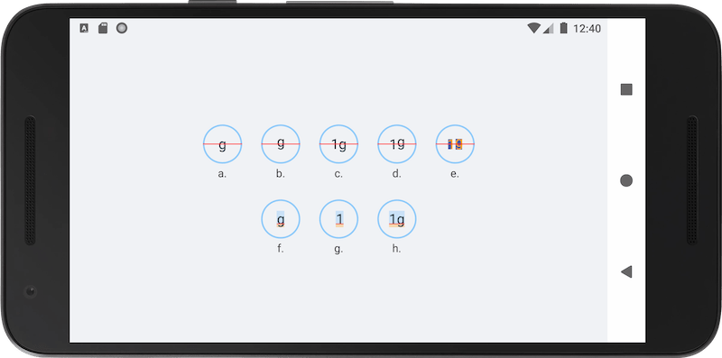
Imagine you’re writing in a notebook. The baseline is the horizontal line that letters “sit” on.
Letters like “a”, “n”, and “1” sit almost entirely above this line.
Other letters, like “g”, “p”, and “y”, have a part that extends below it (descender).
You can see this in images (f), (g), and (h). The red horizontal line is the baseline.
Font metrics Link to heading
Every font has a set of measurements that describe how much space it needs above and below the baseline.
In Android, you can retrieve these measurements from Paint.FontMetrics:
- ascent: The recommended distance above the baseline.
- descent: The recommended distance below the baseline.
- top: The maximum distance above the baseline.
- bottom: The maximum distance below the baseline.
- leading: The extra spacing between lines.
ascent and top have negative values, while descent and bottom have positive ones.
These measurements apply to the font as a whole and aren’t specific to each glyph.
The typographic box Link to heading
Every font reserves a typographic area for each line of text. We can think of this area as a box, which we’ll call the typographic box from here on.
Its horizontal bounds depend on the width of the text.
Its vertical bounds depend on the font metrics values: the upper bound is defined by either ascent or top, while the lower bound is defined by descent or bottom.
For example, in a TextView with android:includeFontPadding="true", the upper and lower bounds are defined by top and bottom respectively, whereas with android:includeFontPadding="false" they are defined by ascent and descent.
This box doesn’t correspond to the actual pixels of the rendered text, but it’s a space the font reserves regardless of what text is displayed.
For example, even if you only draw the character “1”, which has no descender, the typographic box will still include space below the baseline.
This is shown in image (g), where the typographic box is the colored region.
Why a TextView doesn’t work Link to heading
The simplest solution would be to use a plain TextView with the following properties:
android:includeFontPadding="false"
android:gravity="center"
As shown in image (a), the text appears to be slightly off-center.
This happens because android:gravity="center" centers the typographic box inside the TextView. Since ascent and descent may differ, however, the typographic box isn’t necessarily symmetric around the baseline, so characters don’t appear visually centered.
Also note that since we set android:includeFontPadding="false", ascent and descent from the font metrics are used for the vertical bounds of the typographic box.
Finally, we could achieve the same result in our own custom view if we computed textY in onDraw() as follows:
val textY = cy - (textPaint.ascent() + textPaint.descent()) / 2f
instead of:
val textY = cy - textBounds.exactCenterY()
Centering with getTextBounds() Link to heading
getTextBounds() returns the smallest rectangle that tightly fits the pixels that will be drawn for a String. This rectangle is called the boundary box.
exactCenterX() and exactCenterY() give the center of this rectangle.
In our case, where the String consists of a single character, the boundary box wraps exactly that character.
By subtracting the center of the boundary box from the center of the circle (cx, cy), we place the boundary box (and by extension the character) exactly at the center of the circle, as shown in image (b).
Handling multiple characters Link to heading
If we apply this solution to a String like “1g”, where the characters have different boundary boxes, the result will look like image (c).
“1” appears higher up because the boundary box returned by getTextBounds() includes the descender of “g”, which shifts the visual center of the boundary box downward.
To avoid this issue, we can draw each character separately, centering it vertically based on its own boundary box:
// Add the following private val:
private val charBounds = Rect()

// Delete the init block. It is no longer needed since we call getTextBounds()
// for each character inside drawText().

private fun drawText(canvas: Canvas, cx: Float, cy: Float) {
		val totalWidth = textPaint.measureText(text)
		var currentX = cx - totalWidth / 2f

    for (char in text) {
		    val charStr = char.toString()
        textPaint.getTextBounds(charStr, 0, charStr.length, charBounds)

        val charY = cy - charBounds.exactCenterY()
        canvas.drawText(charStr, currentX, charY, textPaint)

        currentX += textPaint.measureText(charStr)
    }
}
This way, each character is centered independently on the vertical axis, meaning a “g” and a “1” will have different Y values.
This is shown in images (d) and (e).
It’s worth noting that with this approach, characters no longer share the same baseline, which could make the text harder to read.
Finally, with this implementation, you’ll also need to compute X separately for each character.